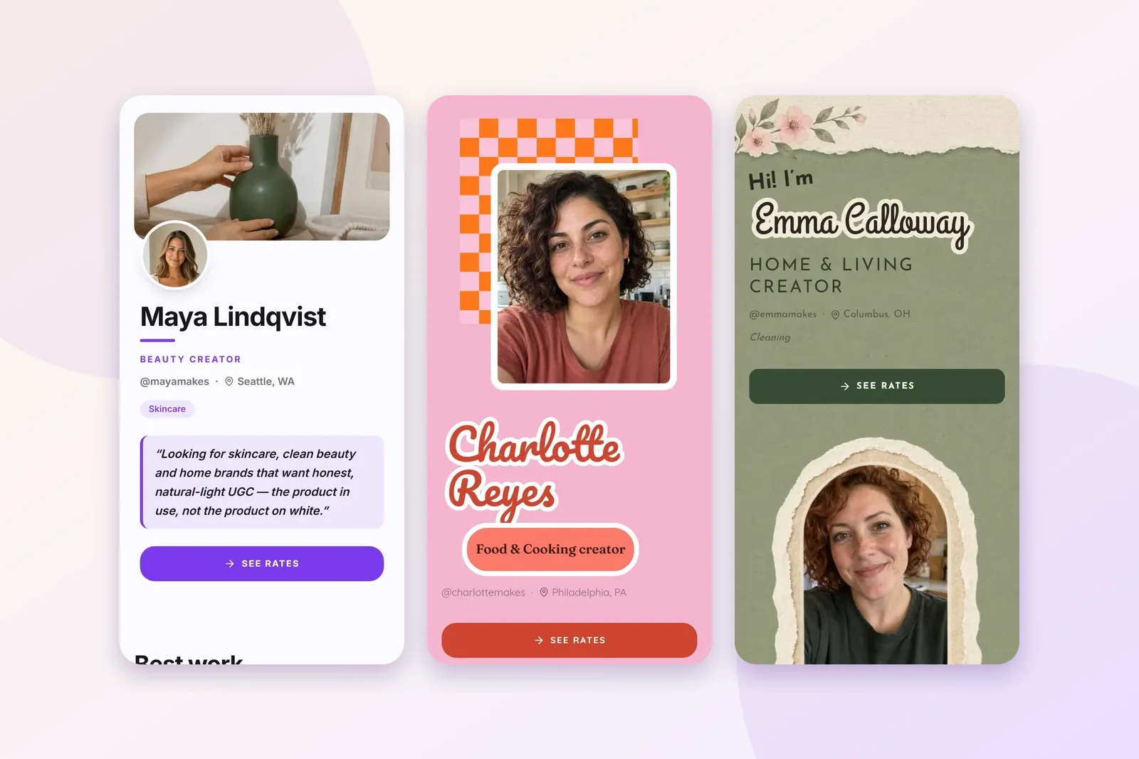
Every example below is a demo page built on Plug Pro, so you can copy what works.
I want to be clear about that up front. Maya, Charlotte and Emma aren't real people, and nothing on their pages is a real result. The brand names, the reviews and the prices are placeholders we filled in so the layouts look like they would with your work in them. I'm showing them because they're good for one thing: seeing how a page is built.
If UGC is new to you: it stands for user-generated content, meaning short, natural videos of a real person using a product. Brands pay creators to make them and post them on their own accounts and ads. A UGC portfolio is the one page that shows a brand those videos and how to hire you.
Maya: beauty, on the Classic layout
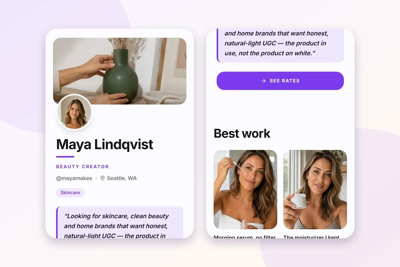
At the top: a wide cover photo, a round profile photo on its edge, her name, "Beauty creator", her handle and city, and a Skincare tag. Then the line that does the work: she's looking for skincare, clean beauty and home brands that want honest, natural-light videos, "the product in use, not the product on white". A purple See rates button sits right under it.
How the work is shown: a "Best work" grid of photos, each with a one-line caption saying what it is. Below that, a Videos row where each clip carries a label like talking head, GRWM (get ready with me), unboxing or ASMR. A brand can see her range without opening anything.
How a brand books: an "Order from Maya" section with three packages. Each one lists exactly what's included: how many videos, how long they run, how fast they arrive, and how long the brand can use them. There are single services too, and a Start an order button at the very bottom.
What I'd copy: the line under the name. It names the kinds of brands she wants and the kind of video she makes, in one breath.
Charlotte: food, on the Pop layout
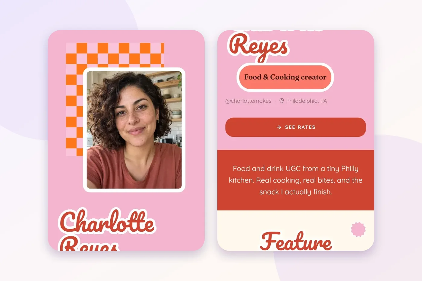
At the top: her photo on a checkerboard card, her name in a big retro script on pink, a "Food & Cooking creator" pill, her handle and city, and See rates. Then a red band with her line: food and drink videos "from a tiny Philly kitchen".
How the work is shown: "Feature projects" are videos tagged by type, then a row of brand names, then product photos with captions like "weeknight sauce taste test" and "first sip reaction". The captions say what's happening, not just which brand it was.
How a brand books: packages with what's included, plus single services. Hers adds a Gifted/PR option for brands that want to send product instead of paying. The page closes with "Have your people call my people" and a Start an order button.
What I'd copy: the captions. "Picnic pour" tells a brand more than "Video 6".
Emma: home and family, on the Sage layout
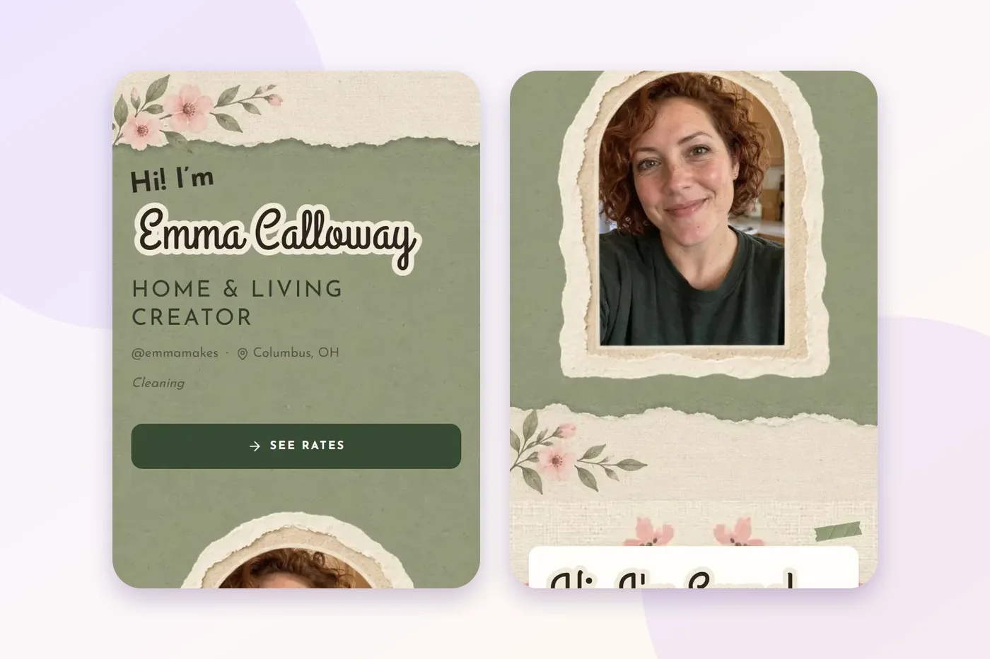
At the top: "Hi! I'm" above her name in script, "Home & Living creator", her handle and city, a Cleaning tag, and See rates. Then an arched portrait in a torn-paper frame.
How the work is shown: her videos are grouped by niche, Parenting & Family in one row and Home & Living in another. If a brand only sells kids' products, they go straight to the row they care about. Photos follow, captioned like "five-minute toy reset" and "Sunday bed refresh".
How a brand books: packages, single services, and a "Let's work together" close with a Start an order button.
What I'd copy: grouping by niche. If you make videos for two kinds of brands, split them so each brand sees its own work first.
Four more layouts, and who they suit
The three pages above are each on one layout. Here are four more from the template gallery, shot on the same demo pages. Plug Pro has 18 free layouts in all.
Calm: Linen
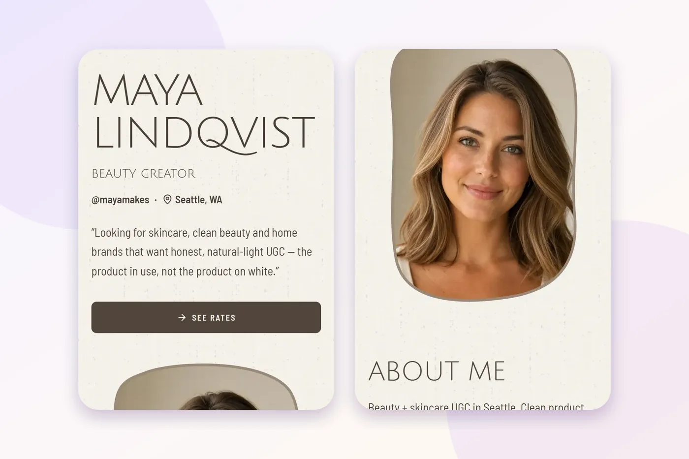
Thin capitals, ivory paper, one portrait in a soft shape. Nothing fights your videos for attention. I'd pick this for skincare, wellness, or anyone whose content is quiet and well lit.
Warm and bold: Retro
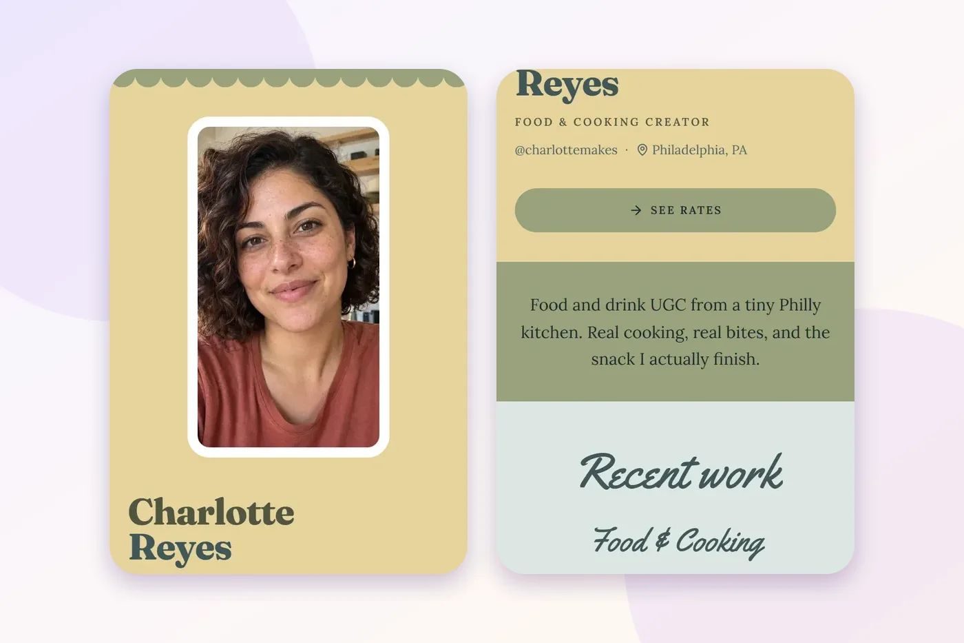
Butter yellow, a scalloped edge, and a chunky name. It feels like a recipe card. Good for food, snacks, or any brand with a friendly, colourful look.
Video first: Showreel
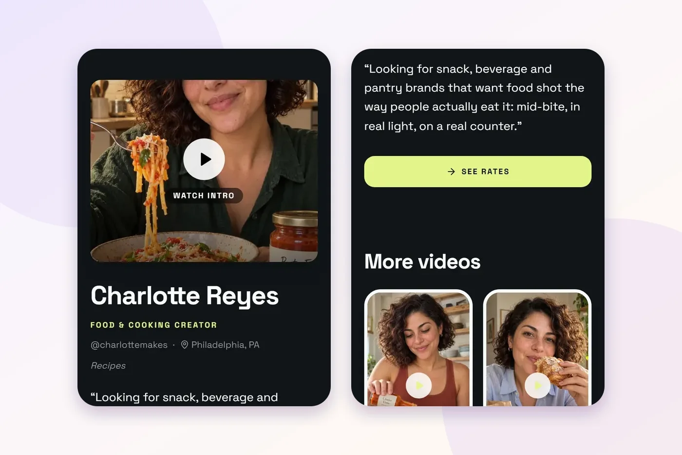
A dark page with your intro clip right at the top and a Watch intro button. If talking to camera is your strongest skill, this puts it first, and a brand hears your voice before they read a word.
Few samples: Mosaic
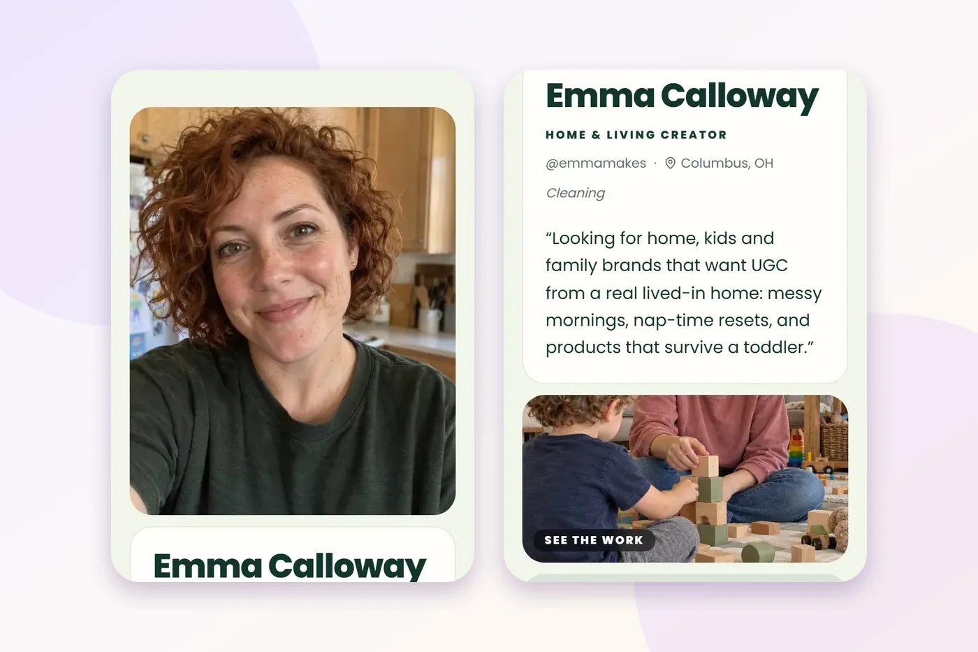
Rounded tiles that look full even when you only have two or three things to show. This is the one I'd suggest if you're just starting and don't want empty space on your page.
What every good example has in common
Strip away the colours and fonts, and all seven pages do the same five things:
- One line at the top saying who they make videos for. Not "content creator". A kind of brand and a kind of video.
- Work within one scroll. A brand sees a real sample before they have to decide whether to keep going.
- A rates button above the fold. It's the first thing a brand taps when they're interested.
- Captions that say what each piece is. "Taste test" and "toy reset" do more than a brand name on its own.
- One clear way to book. Packages with what's included, then a single button.
None of that needs a big following or years of experience. It needs one sample and a clear line, which is how every page starts. If you're ready to build yours, the step-by-step guide walks through it, and the free UGC portfolio page is where to begin.